
Pharmaceutical packaging
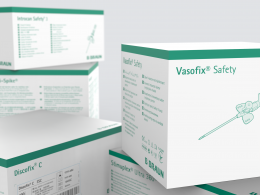
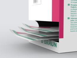
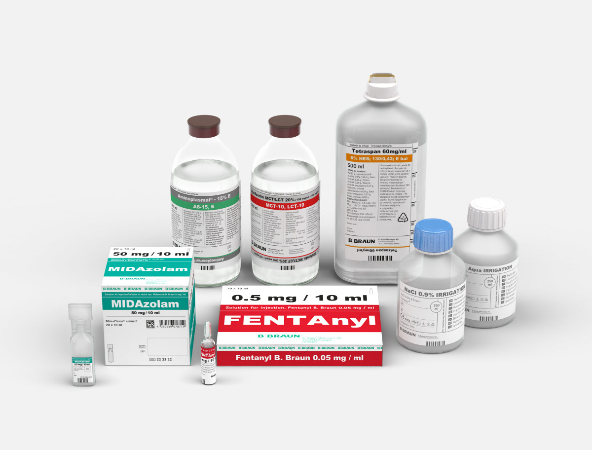
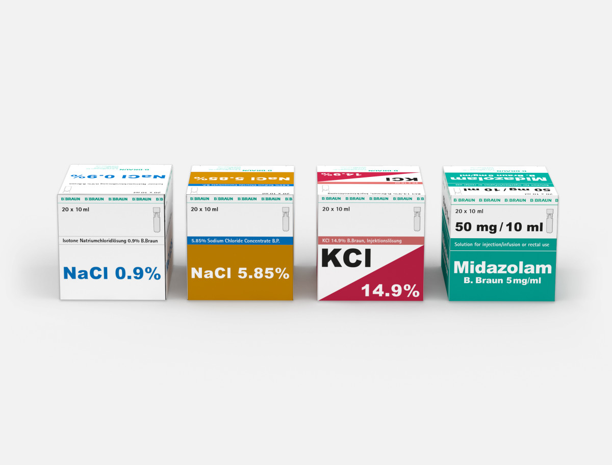
The "Hospital Care" division within the B. Braun Group supplies hospitals with a large number of different infusion liquids (from NaCl to Propofol). For the packaging of these products a uniform design language was developed for the labels on bottles and bags.
The design includes a fixed hierarchy for all product information and combines this with recurring visual design features. In the course of many test series, a graphic style was developed which as far as possible prohibits the mix-up of medicines. This is done using a color coding system which, among other things, uses more color for higher concentrations and identifies hazardous substances with triangles. In addition, the ingredients have been labeled as much as possible in "Arial Black" to draw the eye to exactly this information. By homogenizing these properties, the perception of the B. Braun brand as a "system provider" is strengthened.
The design is based on the corporate product design defined by Held+Team.
2015
Type:Packaging series
Further projects

